Thursday, December 11, 2014

One Hour And Thirty Minutes

The goal: one hour and thirty minutes -- that's how long I have to complete an onsite painting before the light patterns shift to a completely different arrangement (maybe better, maybe worse, definitely different). For the upcoming adventure in Zion National Park I'd like to have that down to 60 minutes. (Canyon Country light can change very quickly, especially when it's at its most dramatic -- sunrise and sunset.) But, for now, I'll settle for an achievable 90.

The solution: get out and sketch and paint every chance I get till it's time to go. (I know, it's a tough job. But someone's got to do it. Right?)

Still Waters: Sunset, Ocean Springs, 12"x9", oils on panel, 
$500 unframed ($550 framed) plus S&H

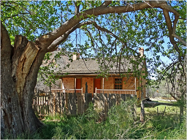
This week's exercise finds us on the Mississippi Gulf Coast, in the small (and oh so picturesque) community of Ocean Springs.

Composition -- a composing frame, either homemade or commercial, aids in quickly and accurately determining what to include (and what to omit) from the final image.

when the clock is ticking a linear sketch in graphite 
can be the fastest way to go

Identifying the prime shapes and plains -- a quick thumbnail sketch helps me identify the most significant shape/masses and their position in space. (Absolutely no consideration is given to detail at this stage.)

Yellow Ochre-toned gessobord with graphite underdrawing

Underdrawing -- many plein air painters will opt to do this with a brush (and I frequently do too). But, if speed is of the essence, a pencil is faster. (It doesn't require constant "reloading" from your palette and it gives me more time to identify the specific colors I'll want to squeeze onto my palette.)


blocking in the basic tonal areas -- initial stage (above), final "rough" (below)


Blocking in -- the priority here is the shadows, since they will be the first to change as the sun continues its journey across the sky (and the first lost if clouds move in). General shapes and compositional arrangements are also established at this phase.

refining the shapes and tonal shifts within the 3-4 spacial planes 

Fine tuning -- awareness of relationships (of shapes, colors, edges, and space) begin to become more accurate at this stage. Still working working rapidly (i.e., no details). Fine tuning form, shadows, middle tones, and introducing highlights.

adding the finishing touches (boldest highlights, core shadows, and fine-tuning gradations)

Finalizing -- identifying and placing the boldest shadows and highlights, adding a bit more variety to the pattern. At this stage I'm frequently spending more time observing and comparing, less and less time actually applying paint.

Polish and Details -- are reserved for the occasional (larger) studio works (and only a few of the plein air sketches will warrant that kind of special attention). For this one, however, I'm thinking maybe 24"x18". What do you think?

Monday, December 1, 2014

Step-by-Step

"A journey of a thousand miles begins with a single step"
                                     -- Laozi (c. 604 BC - 531 BC)

In canyon land the most dramatic lighting is usually experienced in early morning and late afternoon. And -- if (either by accident or by fortuitous planning) you find yourself in the right place at the right time -- you may have no more than an hour to capture on paper, canvas or panel that fleeting delight.

Time (and the sun) wait for no man. So, it would be a dreadful mistake waiting it trying to find the right brush, or paint tube, or to figure out where your darkest shadows or lightest highlights are to be found.

So, well in advance of my actual departure I train: I train my eye -- sharpening my observational skills and increasing my perceptual awareness (the goal being to quickly and accurately capture the essential while editing or eliminating the superfluous); I train with my materials, till my brushes and pencils become an extension of myself and I know intuitively precisely what color combination will get me the specific hue, tint, or shade I'm observing.

During my upcoming adventures I plan on producing some step-by-step demos and time laps videos to share with you. And, since reshooting may not be a practical option, I'll practice creating a few of those now too. (Let me know what you think.)


I've used my View Catcher to select my composition and, starting with a 6"x6" gessobord panel toned neutral gray I rough in the shapes with graphite and begin blocking in the shadow areas (working from a cooler, less intense background to a warmer, more contrasty foreground).


With the shadows in place I begin to block in general areas of middle tone and light middle tone (but reserve my lightest lights and darkest darks for the final stages -- when I am most focused and my observations are most accurate).


I am still working on general relationships at this stage -- light/dark, cool/warm, dull/intense, shapes, and overlapping planes.


I haven't introduced the sky yet. But I am now keenly aware of my lights and shadows, five advancing planes, and the split complementary (red/green, orange/blue, purple/yellow) that dominates my subject.


As my awareness of my subject becomes more specific I continue to fine tune colors, contrasts and shapes -- particularly in the foreground.


Almost there. I now introduce the sky (to compete the color contrasts) and begin finalizing the highlights (reserving the boldest and brightest for the foreground).

Spider Rock, Canyon de Chelly, 6"x6", oils on Gessobord
Done!
_______________________________________________________________________________

At this stage of the adventure prep I'm working on 6"x6" and 6"x8" panels. As my skills sharpen (and especially once I've shed some of my desire to include too many details) and scale up to 8"x8" and 9"x12" panels -- making sure to scale up my brushes too (and reserving my #2 round sable exclusively for signatures only).

If you'd like to see more of these step-by-step demos (with the occasional video demo thrown in) during the lead-up to our little road trip how about dropping me a line and letting me know what you think?

Cheers!

_____________________________________________________________________________

Looking for unique gifts for the holidays? Why not purchase a one-of-a-kind work of art and know you're also helping support my upcoming adventure too? (Spider Rock, Canyon de Chelly can be yours for just $250 unframed/$260 framed, plus shipping and handling (and you'll be billed via PayPal for added security). 

Email me for details or to enquire about other available artwork.


Tuesday, November 25, 2014

Autumn Sunrises and Honing Skills

I don't know about you  but I absolutely love getting up at the crack of dawn (well, technically just a bit before the crack of dawn) when there's a little nip in the air and heading down to the pond to catch the sunrise. If I'm really lucky there's a scattering of small cumulus clouds  just above the eastern horizon to catch the sun's first rays. (Admittedly, with our drought this year there haven't been very many mornings when the sky wasn't completely devoid of clouds. But, when they are present, the view is sublime.)

Sunrise Over Still Waters, 8x6, oils on Gessobord

 Autumn mornings are also a delightful time for long, slow walks with our Welsh collie. We both find the air invigorating and enjoy exploring for new sensory experiences (her for the olfactory type, while I seek visual). After the passage of a rather intense (and wet) cold front this weekend the foliage is taking on its fall colors and there's a good bit of foliage that's been blown to the ground. Hanna (the dog) found this Cottonwood leaf while sniffing about and I was intrigued by the gall on its stem. I drew the front and back surfaces and then dissected the gall with my pen knife (and found it filled with dozens of bright lemon yellow aphid eggs).

Cottonwood Study, 4x6, graphite and w/c on paper

I really like the tingling sensation in my nose as I inhale crisp, cool air and the way you can feel each breath right down deep in your lungs. I savor the smell of smoke from someone's early morning fire as it mingles with the chill in the air. And I take pleasure in the rustle of the breeze through the cottonwood trees (and how it sounds just like a mountain stream). I can't capture that experience in a painting or a drawing. So, I carry a pocket notebook to jot down the thoughts and experiences as they happen -- or write them directly onto the back of a sketch or panel.

Over the coming weeks I'll be working on honing my technical and perceptual skills. I'll be posting the new pieces and observational notes here. And -- just in case you're looking for one-of-a-kind holiday gift-giving ideas -- I'll also be posting the best works in the new online gallery shop on my website . 100% of all sales revenues will go to support my upcoming Zion "expedition". (So, you could purchase some one-of-a-kind artwork AND provide invaluable aid to an art adventure at the same time.) I hope you'll follow my posts here and take a look at the gallery shop too.

Thanks for dropping by. (You're always more than welcome.)

Cheers!

Monday, November 17, 2014

Zion!

Anyone up for a little High Adventure?

Sunrise, South Zion NP 5-14a
sunrise in Zion National Park (to say that the light in Zion is "dynamic" would be an understatement)

The National Parks Service folks at Zion National Park have made their selection for the 2015 season and I've been invited to participate! (http://www.nps.gov/zion/parknews/2015airannounced.htm) In fact, not only am I going to spend a month drawing, painting, and video taping in this awesome natural wonderland... I'm going to be doing it during what is arguably the park's most colorful season -- autumn! (http://www.zioncanyon.com/blog/autumn-zion-national-park/)

Zion National Park - Grotto Building - First Visitor Center
during my stay I'll be living in the Museum-Grotto House (built circa 1927) -- 
just sets away from the Virgin River, hiking trails, and awesome canyon views

Early Fall, Zion National Park
my residency period will begin with the onset of fall color and run through the full (spectacular) range of color change

The current plan is to spend one week driving to Zion (with a couple of "painting breaks" en route -- at Canyon de Chelly and Monument Valley) and four weeks in the park itself. Watch for the launch of my new Kickstarters! crowd funding venture soon. (I'm planning some really interesting "thank you" gifts for my supporters this year -- including artwork, DVDs, and much, much more.)

Zion Canyon view from Angel's Landing - Zion National Park, Utah
you can expect some really spectacular views from the canyon floor (and maybe a few from the rim)

Zions
I even plan to try painting by headlamp (mine, not the car's)

I'll be posting regular (well, as regular as internet availability permits) updates here on the blog -- during the lead-up prep, en route, while in the park, and during my return). And I hope you'll join me here when we launch this exciting voyage of discovery. In fact, if you find yourself in the southern Utah area during my residency, I hope you'll consider joining me for the FREE public workshop I'll be offering (date TBA); I can pretty much guarantee a good time (and door prizes) for all!

Once a Home, Grafton Ghost Town, 4-30-14s
my residency at Zion will even allow a sketching & painting excursion to the ghost town of Grafton 
(setting for the "bicycle scene" from the 1969 film Butch Cassidy and the Sundance Kid)

Stay tune for updates and additional details soon.

Cheers!  

Image credits: All images in this article are used with permission under Creative Commons licensing agreement (https://creativecommons.org/licenses/by-nc/2.0/). Copyright belongs solely to the original artists. My thanks to (from top to bottom) Don Graham, Alan English, Carl Berger, Jono Hey, Eric Ward (no relation), and Don Graham again. 

Tuesday, November 11, 2014

The Intrepid Sketch Hunters: Strathmore Softbound Toned (or "Here There Be Monsters!")

I generally begin each new sketchbook/journal with an inspiring quotation.

The neat thing about sketching in nature (well, one of the many neat things) is that you always encounter surprises... if you're observant.

This week I'm continuing my exploration and evaluation of papers for journaling. And, whenever possible I'm doing it outdoors. (I know, it's a tough job. But, hey! somebody's got to do it.) The selected papers/sketchbooks will be joining me on a new series of field adventures in 2015.

Strathmore - Softbound

Strathmore is a name artists have been depending on for fine papers for 115 years. Earlier this year the company unveiled their new Softbound series. I have my eye on 3 journals in the series for use in in the 2015 project and am testing the 2 toned paper journals this week. (Watch for a separate field test and evaluation of the landscape-formatted Softbound Watercolor journal, and Strathmore's Series 500 Imperial watercolor paper in a future posting here.)

While artists still choose to create most of their drawings on white paper, it is also true that working on a mid-toned paper is the quickest way to produce a tonal/volumetric study of a subject. It's also true that, because works on toned paper aren't as common as those on white paper, toned paper has a visual impact, or "novelty", that white paper doesn't.

rendering volumes on toned paper is a breeze (if you simply 
remember to let the paper represent the middle tone)

Strathmore's Series 400 Toned Gray has a subtle vibrancy due to the inclusion of fine red and blue fibers scattered throughout its surface. The paper will work flawlessly with graphite or pen & ink. But, personally, I find a white and dark (either black or Indigo blue) color pencil particularly appealing for fast, bold renderings in the field or in the studio. Add to this the fact that the surface can easily stands up to repeated erasures without smudging or fraying and you have both a versatile and dependable tool.

toned paper is far more gentle on the eye when working with harsh reflected light 

toned paper can be invaluable for capturing unexpected or fleeting discoveries
(like this fossil I found at my feet while sketching on the fractured limestone above) 
_______________________________________________________________________


tip - putting down a light wash first will increase the "tooth" of the paper's 
surface and make it even more receptive for color pencils

As with the gray, the surface and sizing of the Toned Tan paper is ideal for graphite, color pencil, and/or pen & ink. The 118gm weight of the papers also means both are quite tolerant of repeated light washes, experience minimal surface buckling, and show no sign of fiber lift.

a drawing on toned paper can offer a visual experience that white paper may lack

______________________________________________________________________________________

And remember, when sketch hunting it always pays to be alert -- even when not actually sketching (otherwise you're likely to overlook "monsters").

here there be monsters! 


Thursday, October 2, 2014

Cabin Fever and the Call of the Wild (Tools of the Trade #13)

Well, it certainly has been fun turning my hand to creating and publishing enhanced iBooks (and, with 2 new books already in the works and one very special project in the planning stages, I'm definitely not done with this "new" medium). But, after four books in as many months, I'm feeling a bit of the artistic "cabin fever" and am longing to answer the call of my favorite muse -- Nature.

On top of that I have a new adventure set for the new year (more on that in next week's post) and it's time for me to begin my annual reevaluation of my "kit" (to make certain that old favorites are still the best choices for the field work ahead, and to see what new materials may have come out since my last round of field tests).

So, for the next few weeks I'm going to be taking advantage of the mild autumn weather to pack up my day bag, stretch my legs, renew my relationship with nature, reawaken my observational eye, and test some papers/journals/pens/pencils/etc. And, with your permission, I'll share my findings and observations with you here.

Lanaquarelle 300gm HP 10,5x14,8cm Watercolor Block

Rather than do a superficial treatment of an overwhelming number of papers I thought I'd do an in-depth write up, replete with illustrations and the odd demo, of 2 or 3 papers each week and give readers an opportunity to savor each.


We begin with my go-to paper for postal art from the field -- Lanaquarelle's 300gm 4"x6" (that's 10,5x14,8cm to the rest of the world) HP watercolor blocks! The French Lana company has been making artists' papers since 1590 and this paper reflects all the knowledge and expertise the company has accumulated over that time. It is heavily sized both internally and on the surface, has a texture that is a delight to the touch, and handles mark making (and repeated corrections) without complaint. And, due to its size, the block fits perfectly into jacket or cargo pants pocket.

with a Lanaquarelle block in one pants pocket and pencil box or small w/c set in 
another I'm always prepared for every sketching opportunity

While this is technically not a sketchbook/journal (and that's perfect for me since these very stiff sheets usually head out individually via the postal system to friends and family) the paper takes marvelously to being bound as an accordion structure -- should you end up creating an interesting series during your next travel adventure, or should your spouse wish to put a collection of postcards together as a keepsake. (If this sounds appealing to you but you're not familiar with this simple bookbinding technique leave a comment and I'll see about doing a future post on accordions and cover options.)

Clairefontaine 90gm 14,8x21cm Journal ("Douceur de l'écriture", "Papier Velouté")

I'm not sure that this paper by the famous French stationary maker is technically intended as a drawing paper, but I am so in love with its silky touch, how pencil and pen glide across it effortlessly, and how it handles fountain pen without feathering or bleeding through.

even vintage flex nibs glide across this paper without scratching or feathering

This is probably the thinnest paper I use but is absolutely perfect for longer hikes afield (when your back and legs are going to feel every gram by the end of the day) and you want to be certain that you won't run out of paper while you're still miles from base camp. (This soft-bound volume is just 1cm thick yet contains 96 sheets/192 pages!)

red arrows splint out the location of faint show-through from the next page

This paper is also the brightest white of any paper I use, providing both a delicate foundation for pencil studies and dramatic contrast for pen and ink. And, for such a thin paper, it handles light watercolor washes particularly well (all-in-all a marvelous choice for my finely detailed botanical and entomological field studies).

show-through (but not bleed-through) is most evident when looking at the back of a page

Note: show-through is not necessarily a bad quality (unless you wish to work on both sides of every sheet). In fact, I find it useful as it allows a line guide to show through and facilitates my writing in straight lines. (And, of course, I can simply dispense with the guide when I want my writing to follow a more serpentine course.)
_________________________________________________________________________________

Next week I'll add two or three new illustrated paper tests. (I hope you'll join me then.)

the papers in this test series (minus 2 specialty papers I couldn't squeeze into the photo) -- 
upper row: Stillman & Birn (Epsilon and Zeta Series), Exacompta Sketch Book, Strathmore (400 Series Softbound Watercolor - Landscape & Imperial 300gm)
lower row: Strathmore Softbound Toned (Gray & Tan), TWSBI Journal, Clairefontaine Douceur de l'écriture, Lanaquarelle


Tuesday, September 23, 2014

iBook Bonus(es) Anyone?

The new book is up and running smoothly now. And I'm getting some very nice feedback from those of you who have had a chance to look inside. But I've been thinking that it would be really nice if I could offer a bonus for everyone who pre-orders The North Cascades: A Tale of Two Seasons (Spring). So, here's what I'm going to do: I'm going to mail a print of one of my pen & ink with watercolor studies* from the Stehekin series (plus a hand-written note signed with my Chinese seal) to each person who pre-orders my new book from one of the 51 iBooks Stores worldwide between September 15 and October 14! (*My plan is to have 4 images to select from. I'll post the first 2 here today; watch for the other 2 options to be posted here soon.)

the first bonus print option

To receive your signed print in the mail just PM me (or post in the Comments section here) after you place your order any time between now and Oct. 14. Then, once you've downloaded the iBook, email me a copy of your purchase confirmation from Apple (Be sure and redact any personal info, account numbers, etc.), a mailing address I can send the print to, and your choice of print(s). And the watch the mail for your "Thank You" bonus!

Not enough? You want more? Well -- if (either after you've had a chance to look over the free sample excerpt available at the iBooks Store, of after you've downloaded the entire book) you visit the iBooks Store, rank the book, and post a brief note -- I'll send you a second print. (Please note this offer will expire Monday, November 6.)

the second bonus print option (2 more to come)

Well, that's it for this week. I'm busy working on the next book, and am looking forward to the final Zion National Park A-i-R interview next Monday. (Very exciting!) And next week I'll have something completely new and different to share with you.

Cheers!

______________________________________________________________________________

Todays country links for The North Cascades --


Monday, September 15, 2014

"Houston, We Are Cleared for Launch!"

"Houston, we are cleared for launch. T minus 30 and counting."

To maximize the multi-media experience for readers unfamiliar with the Multi-Touch 
format a 3-page user's guide to the book's "bells and whistles" has been included

Well, OK, I don't live in Houston and publishing a media-rich, interactive ebook isn't exactly rocket science. (Although, for someone who usually makes his living with technologies that harken back to the Rennaisance and beyond, it can sometimes "feel" rather Buck Rogers.)

Hi-res panoramas, oils sketches, and (on the following page) finished paintings abound

Everything has been checked -- images are all in place, the text has been proofread (thrice) for typos, all the videos run, and all scrolling sidebars scroll. Apple has approved the final manuscript (all 155 pages). Sales begin in 51 markets* world-wide on October 15. (That's where the "T minus 30" came from.) And pre-orders begin TODAY!!!

Pages from my journals are reproduced throughout the book

If you like the images in this post (All are screenshots from the book.) please visit the iBookstore (https://itunes.apple.com/us/book/the-north-cascades/id916569774?mt=11&uo=4&at=1l3voTi) to see more. Be sure and download the FREE sample excerpt. And, if you find it interesting, I hope you'll buy the book... and tell your friends. (Please note that 100% of my royalties go to support future adventures and the books they generate.

Text from my adventure blog is combined with excerpts from my field 
notebooks and all-new notes and observations

Thanks, as always, for your support. 

* NOTE: To make navigating to the Apple iBookstore easier for readers living outside the U.S. I'll be posting hyperlinks (2 each day) to stores in each of the 51 countries currently served in the Comments section below. (If you don't see yours please check back or PM me.) Cheers!

Monday, September 1, 2014

North Cascades - The Final Progress Report!

early blocking in of what I thought would be the last painting

Yep, it's finally complete. All the text. All the images. All the neat interactive bells and whistles. This week the final manuscript is with the proof readers and (barring any typos and/or omissions) it should be off to Apple for final approval by week's end. So, you can expect the next "North Cascades" posting to be the announcement of the release date... and the rolling out of the free excerpt!

and blocking in the foreground

Oh, I know I said in my last progress report that I only had one oil painting to complete. Well, I didn't allow for how much fun I have with Gamblin oils and Ampersand Gessobord panels.... And one painting became three. (I can't tell you just how hard it was to stop myself at three!) So, the final count looks like it'll be 83 works on paper, 23 oil panels, 13 videos, and 152 photos.


early stages of the first "bonus" panel

To all of you who have waited so patiently while I worked on this project (and especially those of you who offered words of support and encouragement over the past couple of months) I offer my most heart-felt thanks!


and the W-i-P phase of the final panel

Wednesday, August 20, 2014

North Cascades - The Penultimate Progress Report

adding a 1951 Chevy DeLuxe to the "cultural artifacts" journal 

I've selected the final 83 works on paper, 20 oil paintings, 156 photos, and 13 videos for the new book. I have one more panel painting (OK, maybe two) to prepare while I do the final proof reading. And then North Cascades can be sent off to the publisher. (Yea!)

completing a study of balsamroot (this time sans bears)

I thank you all for your patience and support while I've been working away at this project over the past few weeks.

And, if all goes well, my next post will be to announce the release date for North Cascades: A Tale of Two Seasons (Spring). Cheers!